Our Brand
Where the name comes from.
Voltera was not named by a branding agency. It came from the same place the company did — a clear-eyed view of what the industry needed and a founder who had spent years watching it fall short.
Volt. Era. A new era powered by the right infrastructure. That is the idea, and it has not changed.
Logo Meaning
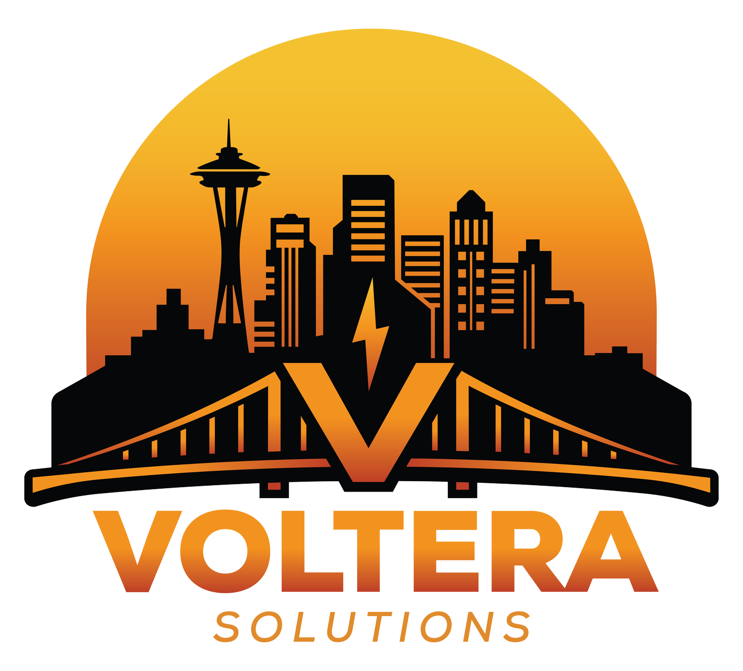
Seattle's iconic skyline, including the Space Needle, honors the founder's upbringing just minutes from Microsoft's campus — evoking the beauty, innovation, and energy of his Pacific Northwest roots. The rising orange sun represents Arizona, where Voltera was founded after years spent advancing multifamily technology innovation across the country.
The bridge in the foreground is deliberate. It represents what Voltera does — connecting fragmented building technology systems into a single, coordinated whole. At the center, the electrified V captures the voltage and forward momentum that defines how we approach every project.
Name and Identity
Voltera combines "volt" from voltage with "era" — signaling a new era of technology where buildings are not just connected, but integrated and intelligently managed. It captures our mission to design and deliver systems that work together as a unified foundation for modern commercial real estate.
"Sol" from Solutions also echoes the Latin root for sun, reinforcing the sunrise palette and the voltage theme. Light, energy, and clarity brought to complex property infrastructure. Together, the name, skyline, bridge, and rising sun form a single unified identity — one that is specific, intentional, and built to last.